
To match the energy of this year鈥檚 edition, the visual direction is centered on movement.


This renewed attitude for the brand identity marks a complete transformation of the Festival visible in every part of its ecosystem.
This year鈥檚 visual expression showcases how the Williamstown identity can flex year to year without losing its core foundation.

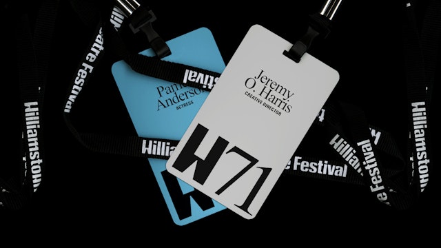
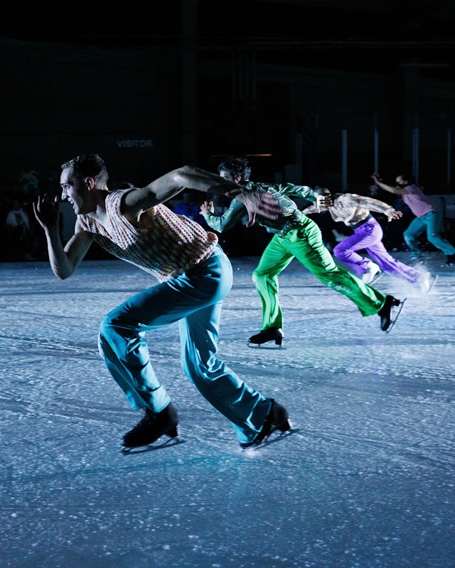
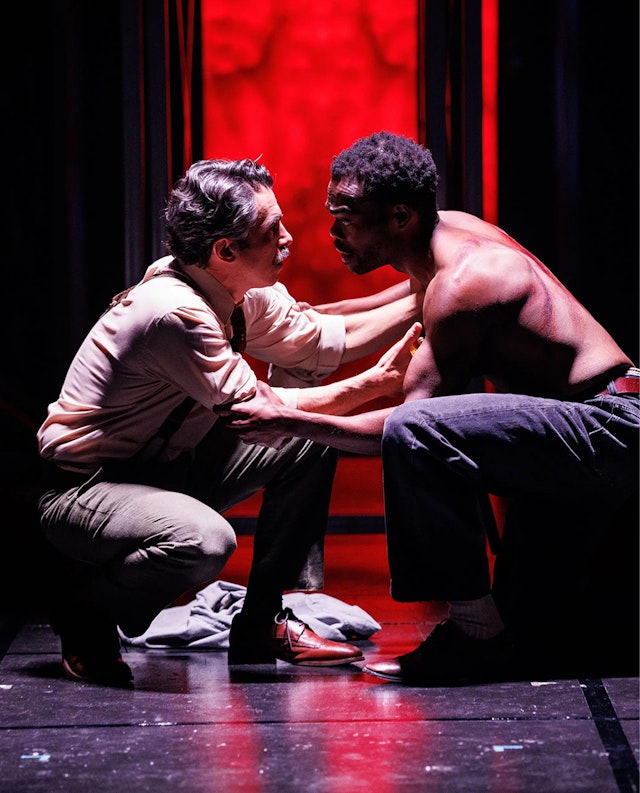
The 71st edition of the legendary in 2025 marked a bold expansion of the programming with a rethinking of the schedule resulting in three immersive weekends rich in experiences and incredible casting (like the reborn star Pamela Anderson). Under the new visionary leadership of Creative Director Jeremy O. Harris and Managing Director Raphael Picciarelli, the Festival pivoted to maintain its loyal fans while also making theater relevant and inviting to younger audiences traveling from urban centers like NYC or Boston.
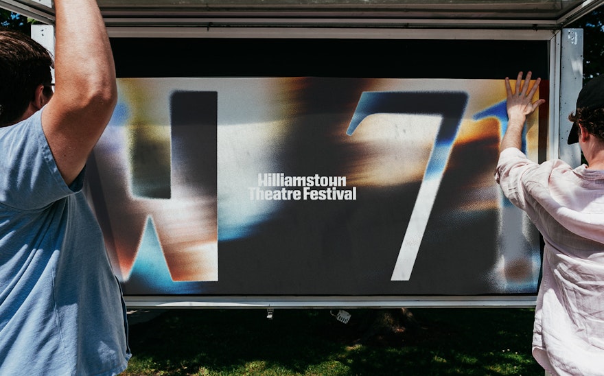
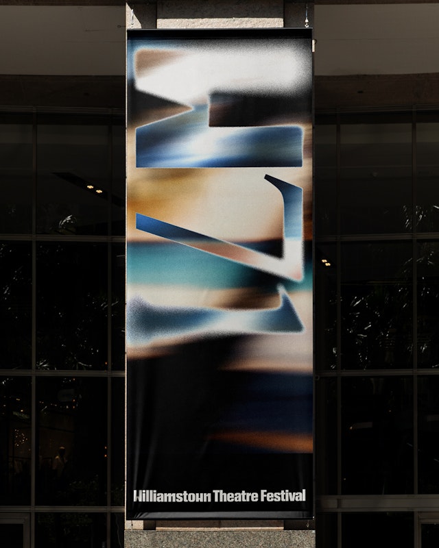
To match the energy of this year鈥檚 edition, the visual direction is centered on movement. Interpreted through a motion behavior of blur that affects photography and typography, moments in time are frozen as they happen. Pentagram partner Andrea Trabucco-Campos and team worked closely with the Williamstown creative leadership to develop a series of key images that conveyed the essence of each performance. The team then animated them using Runway and AfterEffects to make them dynamic and seamless with the rest of the visual system.
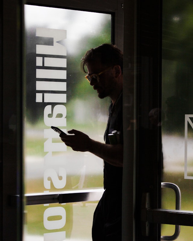
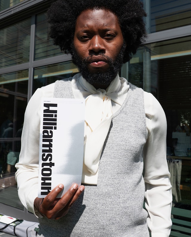
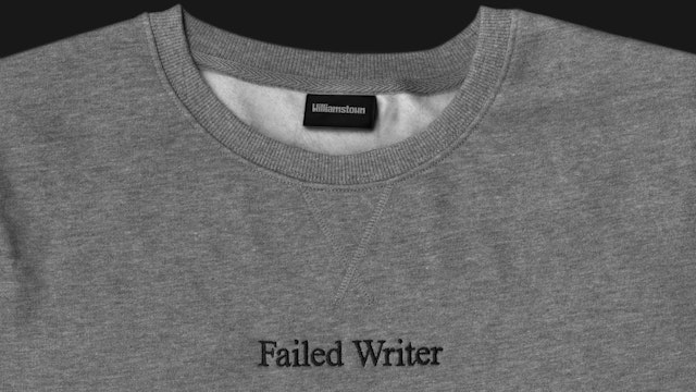
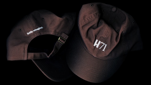
This renewed attitude for the brand identity marks a complete transformation of the Festival visible in every part of its ecosystem: the town鈥檚 takeover through signage and wayfinding, key visuals for every performance, program design, badges, digital billboards, social media framework and unique merch.
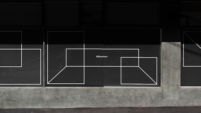
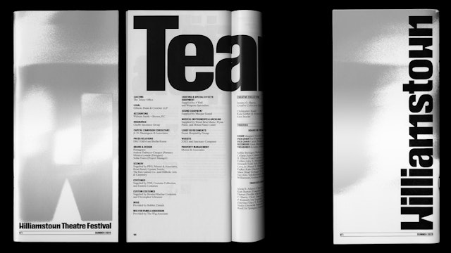
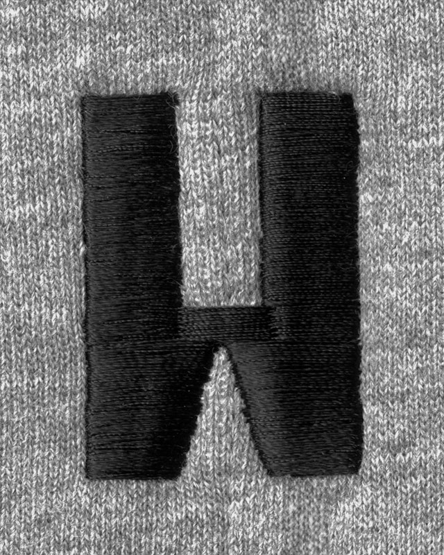
This year鈥檚 identity also cements the fundamental parts of the Williamstown Theatre Festival design system established with the 70th edition: a new iconic logo with the monogram W, the graphic system of dynamic stages, and a unique typographic combination of bold type in Review Condensed with the evergreen Times New Roman.
Combined with this edition鈥檚 art direction, this year鈥檚 visual expression showcases how the Williamstown identity can flex year to year without losing its core foundation. With time, these elements accrue equity when shared and reshared as emblems of the great immersive experiences offered by Williamstown.
Office
- New York
Partner
Project team
- M貌nica Losada
- Doyeon Kim
- Pablo Nietos
- Sofia Flores
Collaborators
- Maria Baranova, production photography
- Arden Dickson, environmental photography
