
The designers went into the project keeping in mind that the new identity wouldn’t just be for a new subdivision or housing development, it would be for a new U.S. city.

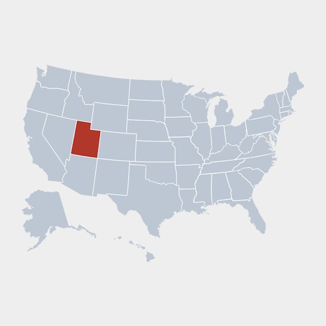


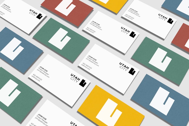
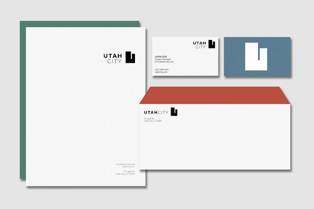
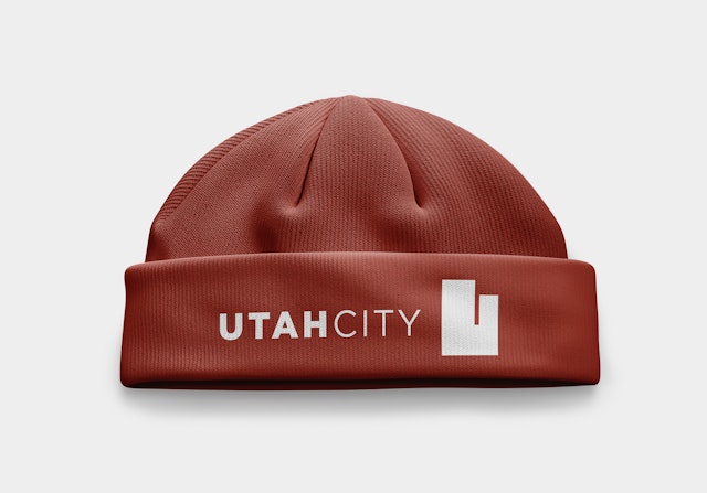
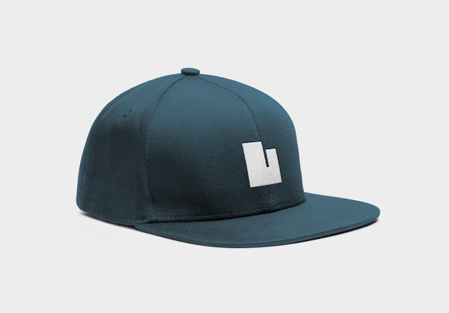
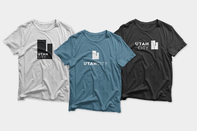
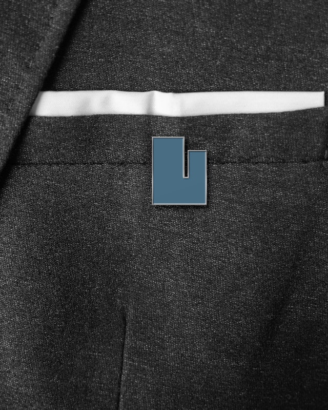
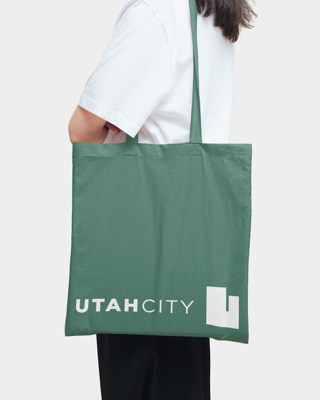
The winning solution is a mark in the shape of Utah state, a cap letter “U,” for Utah City, and a simple cityscape.


The guidelines include a custom color palette for the new city inspired by its home on the eastern shore of Utah Lake with colors named Obsidian, Cloud, Lake, Life, Clay and Hive.


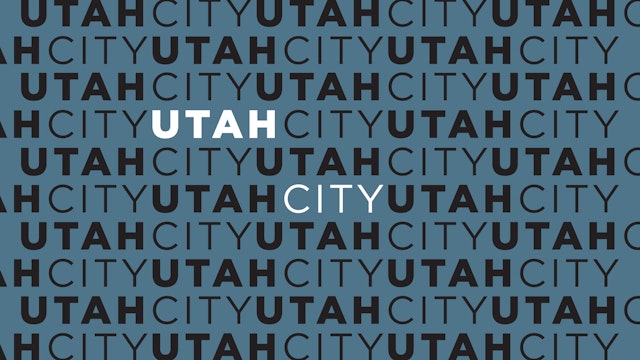


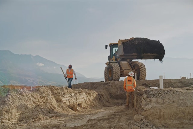
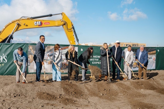

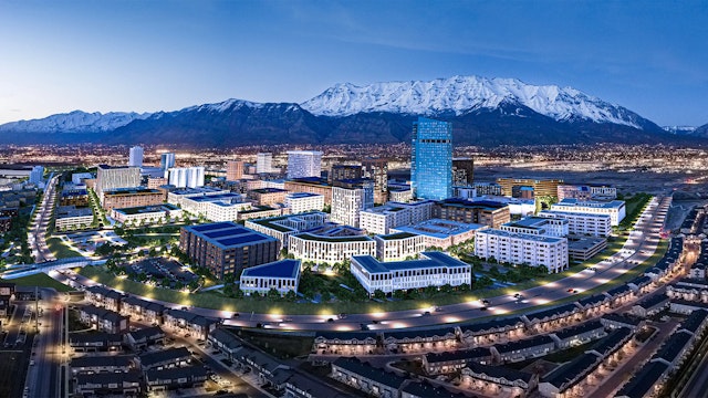
The Austin office of Pentagram has named and designed the brand identity for an urban development in Utah that has bold ambitions to be a new U.S. city. The community, now named , is in the early stages of construction and began leasing this year.
In the Fall of 2022, Pentagram Austin took a call from a developer with an intriguing request. The developer, Woodbury Corporation based in Salt Lake City, told the Pentagram team they had plans to build an ambitious 700-acre master-planned community on the site of a defunct steel mill located at the base of the Wasatch Mountains in the vicinity of Vineyard, Utah and they wanted Pentagram to name the new “legacy development” and create its brand identity.
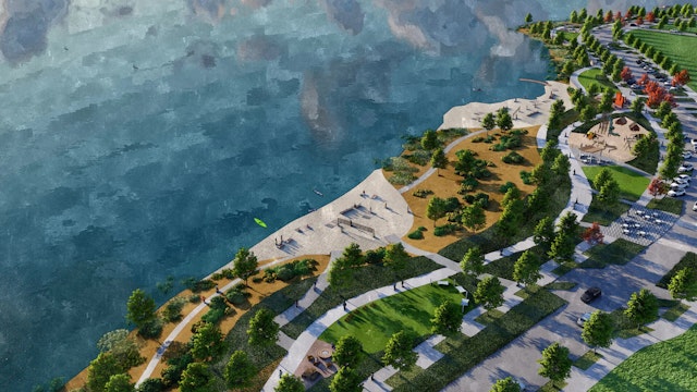
At the time, Woodbury, who is partnering with the Flagship Companies builders on the project, made it clear that their ambitious plans were to design and build a modern, walkable, sustainable city of the future they hope will end up being as established and well-known as other major metropolises in the state of Utah like Salt Lake City, Park City and Provo–not just another housing development or subdivision. The sprawling urban destination is following plans developed by a team of top-notch planners and architects and will have its own train station and an emphasis on public transit. Utah’s newest city, now a part of Vineyard, will eventually be on maps of the United States as a stand-alone, urban destination.
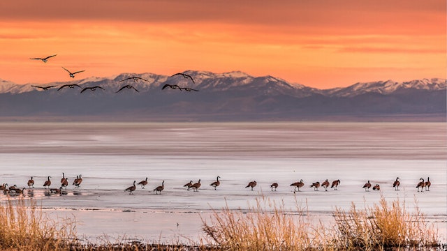
Pentagram began the naming process by researching the region in north-central Utah, called the Wasatch Front, where the new city is being built. Utah has a rich Native American heritage which was the foundation for the naming of many early settlements and prominent natural landmarks in the area including the Wasatch, a name that originates from the Ute Indian language which translates to “mountain pass.” The melting snow from the Wasatch Range feeds Utah Lake, the state’s largest freshwater lake and the location of the new metropolis taking shape on its eastern shore.
Utah Lake took its name from the state of Utah, also derived from the Utes. The name “Utah” translates to “people of the mountains.” The Pentagram team explored potential city names based on the colorful Native American history of the area but ultimately decided against the further appropriation of the indigenous people in the region.
The design team also investigated the Mormon heritage of the area, as pioneers of the Church of Latter-Day Saints were some of the first settlers to arrive in the region. The building of the first railroads had a significant impact on the culture and economic growth of the region—this connection seemed particularly apropos because of the development’s plans to build a train station and its public transit orientation. The city’s location on the shores of Utah Lake also provided the Pentagram team several directions to explore, including the names of fish and waterfowl that inhabit the lake and words and names inspired by snow, water, boats, nautical terminology and shorelines.
Initially the Pentagram team worked up a list of over a hundred names but ultimately narrowed it down to about half of that. The resulting list of finalists was promising, but none of the names seemed exactly right for a new U.S. city until the answer suddenly revealed itself. The unique “Utah-ness” of the development’s location ultimately gave the designers a major clue for what became the winning name. The anticipated growth of Utah and Utah County, along with the ambitious scope of the project, plays into the new, all-encompassing city name. Currently, there are 3.3 million residents in the state, a number that is expected to grow to 5.2 million by 2060, and 30% of this growth is expected in Utah County.
During the initial kickoff call, the developers mentioned two prominent urban destinations in Utah, Salt Lake City and Park City, as inspirations. That’s when it dawned on the Pentagram team that there were other established metropolises across the nation that combined the name of their state and “City” in their names. Cities like Oklahoma City, Kansas City and “The City that Never Sleeps,” New York City. The designers realized that New York City–in New York County–in the state of New York was a good model for the naming of a new city located in the state of Utah–in Utah County–on the shores of Utah Lake. And there was the winning name–Utah City!
To the design team’s pleasant surprise, it was discovered that a city named Utah City didn’t exist already and there wasn’t a municipality called Utah City in any other state in the union either. At the end of the first-round naming presentation, the Pentagram team boldly announced that they had found the name of Utah’s newest city. When the developers first heard the name Utah City, they looked slightly underwhelmed, but once they realized they could own the valuable name “Utah City” in the city’s namesake–the state of Utah, they got very excited and purchased all the URLs for the name on the spot. Now the marketing team for the development promotes Utah City as one of the three prongs of Utah’s “Tri-Cities,” an equidistant triangle that includes Salt Lake City and Park City.
With the name selected, the design team got to work on the brand identity for Utah City. The designers went into the project keeping in mind that the new identity wouldn’t just be for a new subdivision or housing development, it would be for a new U.S. city. The team explored several promising directions but quickly landed on an obvious but effective solution. The state of Utah is shaped like a vertical rectangle with a square chunk missing from its upper right corner; it is recognizable and unique amongst the rectangular U.S. states. The winning solution is a mark in the shape of Utah state, a cap letter “U,” for Utah City, and a simple cityscape.
The wordmark “Utah City,” set in Gotham, all caps and run together, highlights the name of the state in Gotham Black. Designed by Tobias Frere-Jones and released in 2000 through H&F (now known as Hoefler & Co.), Gotham is a geometric, sans-serif typeface that is among the most widely used fonts of the last two decades. The typeface was inspired by the architectural lettering from mid-century New York City. Unlike other sans-serif typefaces which might feel German or Swiss, Gotham looks and feels distinctly American. For that reason, and because of its roots in the most famous U.S. city named after its host state, the Pentagram team felt it was a good choice for Utah City.
Once the identity was approved, the team developed a set of style guidelines for the yet-to-be-built city that governs the use of other identity tools for expressing the brand including additional identity lockups, supporting typography, and guidance on using the identity system properly and effectively in a variety of different application scenarios. The guidelines include a custom color palette for the new city inspired by its home on the eastern shore of Utah Lake with colors named Obsidian, Cloud, Lake, Life, Clay and Hive.
