

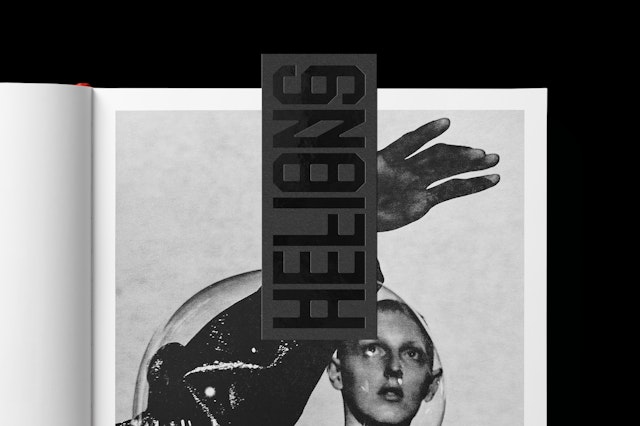
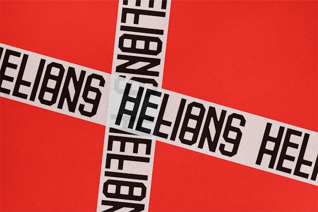
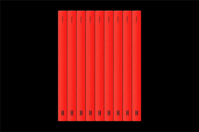
The team designed the Helions wordmark with an optical effect that mimics light refractions and complements Davison’s experimental approach to image making.
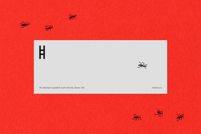


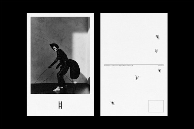
Matt Willey and team have designed the brand identity for , a new publishing house founded by photographer .
The name of the company is a reference to the village that Davison grew up in, Helions Bumpstead. The team designed the Helions wordmark with an optical effect that mimics light refractions and complements Davison’s experimental approach to image making. When reduced to a symbol, the “H” logo resembles a film strip.
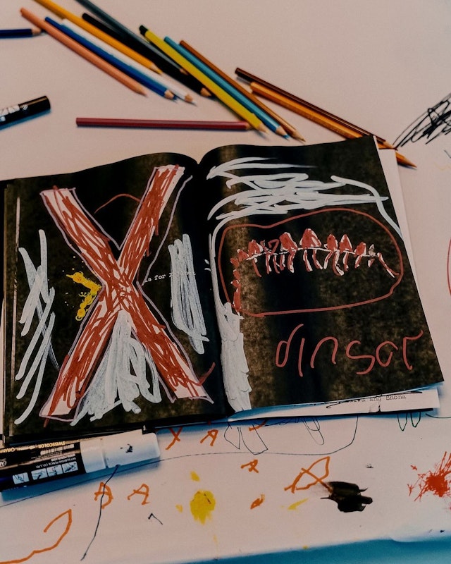
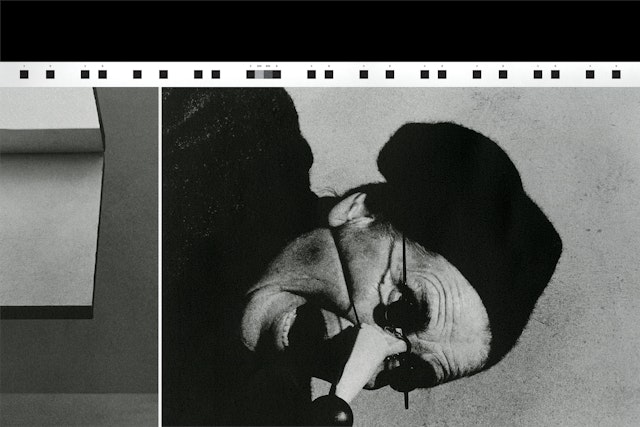
The team also designed the first two Helions releases, and ‘ which were produced as companions to Davison’s first short film.
