The rebranding is part of a broader effort to foreground Yale’s leadership in engineering innovation and its dedication to practical, real-world impact.
The Pentagram team immersed themselves in the culture of Yale Engineering to help define its identity and clarify its narrative.
In coding, the slash serves as a bridge or connector—linking elements while placing them in contrast. In the Yale Engineering identity, it functions as a versatile brand device, adaptable across the entire system.


At the heart of the system is a generative design tool, giving the in-house team the ability to quickly produce unique, sophisticated imagery and animation.


For over a century, has led the way in developing and integrating technology to tackle complex challenges and address critical societal needs. Distinctive in its cross-disciplinary approach, the School’s faculty, researchers, and students collaborate with partners across campus to create new materials and build innovative systems—all with the goal of advancing solutions that improve the human condition.
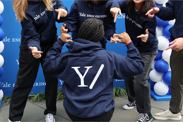
Pentagram created a new brand identity framework for Yale Engineering that highlights its unique culture of innovation and collaboration across disciplines. The system encompasses brand strategy and positioning, a streamlined name, and a new brand mark—a forward slash—that symbolizes its spirit of connection and cooperation. A generative design tool brings the identity to life, producing custom typography and patterns that extend across a wide range of applications, from digital newsletters and social media to campus flyers, apparel, and Yale Engineering magazine.
The rebranding is part of a broader effort to foreground Yale’s leadership in engineering innovation and its dedication to practical, real-world impact. Pentagram collaborated closely on the project with the team at Yale Engineering, including Dean Jeffrey F. Brock.
“We wanted an identity that had much more of a forward-looking orientation, something that would convey to our students a sense of possibility about the School of Engineering and Applied Science,” Brock says. “It also needed to signal externally both to potential faculty recruits and also to the broader engineering community that Yale was investing in an important area for the future of the University, and the future of the world in general.”
To distinguish itself from other schools—and bridge a gap in education—Yale Engineering emphasizes the vital role of the humanities in the field. This approach fosters a deeper understanding of technology through the lens of human nature, reflecting Yale’s longstanding strength in the liberal arts. Yale Engineering views the world not only through technological innovation, but also with the added dimension of humanistic insight for which the University is renowned.
The Pentagram team immersed themselves in the culture of Yale Engineering to help define its identity and clarify its narrative. They visited the campus, spoke with students, faculty, alumni, and other key stakeholders to gain deeper insights, and researched the history of typography and color at Yale. While the University has a strong overarching brand, Yale Engineering previously lacked a distinct visual identity of its own, relying solely on Matthew Carter’s Yale wordmark. The new system needed to operate within this well-established institutional framework while asserting its own autonomy.
“The system succeeds by retaining consistent elements that connect back to the visual identity for the University, while giving each department and unit at Yale Engineering the opportunity to work within certain parameters to define itself,” Brock says. “It’s visually engaging, and it’s very much consistent with our sense that we live in a University that has many aesthetic touchpoints with art, architecture, and other points of strength on campus.”
The strategic identity centers on a concept the designers called “Co/lab,“ and the brand personality encourages an ethos of mutual collaboration and experimentation. This is captured in the new brand line, “What’s Next,” which doubles as both a question and an answer––emphasizing that Yale Engineering is where fundamental mastery meets risk-taking, improvisation and invention.
During their research, the Pentagram team learned that most of the university community does not actually use the full name (Yale School of Engineering and Applied Sciences) or acronym (Yale SEAS) when speaking or writing about the School; rather it is colloquially known as Yale Engineering. The new identity embraces this more straightforward name.
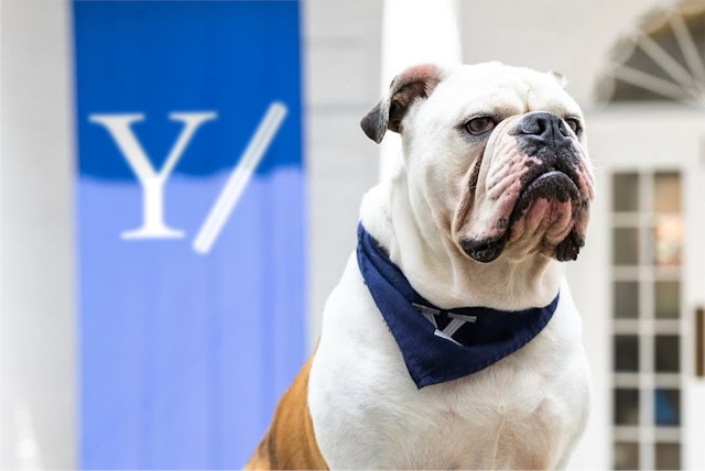
The insignia pairs the Yale “Y” with the slash. In coding, the slash serves as a bridge or connector—linking elements while placing them in contrast. In the Yale Engineering identity, it functions as a versatile brand device, adaptable across the entire system. The slash unites diverse ideas and applications, anchoring the visual language from the brand mark and typography to patterns and 3D motion. Its faceted, dimensional form nods to the concept of engineering as something built and tangible.
The , designed by Tobias Frere-Jones, is used across the University’s institutional identity. Collaborating with Frere-Jones, the Pentagram team created a custom version for Yale Engineering that incorporates a bit of the dimensional slash in hexagonal tittles. The dimensional lines also inspired a bespoke icon suite that translates the angles of the slash to flat symbols.
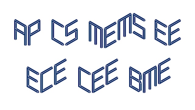
Yale Engineering currently comprises six departments, though this number may change in the future. To accommodate that flexibility, Pentagram designed a bespoke 'departmental' display typeface, enabling the School’s in-house communications team to easily create new or updated departmental marks as needed. Constructed from dimensional lines that echo the slash, the letterforms have an improvisational, built-as-you-go quality that reflects the School’s collaborative 'co/lab' ethos.
The variable typography is paired with a bold, versatile visual approach that can adapt fluidly across the brand. At the heart of the system is a generative design tool, giving the in-house team the ability to quickly produce unique, sophisticated imagery and animation. Pentagram created a motion toolkit for 2D and 3D outputs, with movement behaviors inspired by the School’s diverse disciplines—from quantum mechanics to applied physics—that convey a kaleidoscopic perspective.
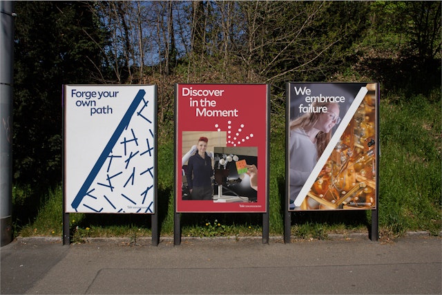
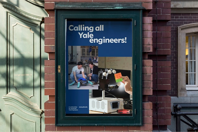
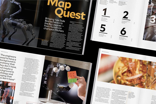
In addition to 2D and 3D patterns inspired by the slash, the visual language introduces a more intentional, editorial approach to photography. Rather than simplifying or glossing over the complexity of its subjects, the imagery tells stories in a direct, engaging way that draws viewers in. Reflecting Yale Engineering’s mission to bridge disciplines, the framework enlists expert imagemakers from the Yale School of Art to document the program. This highly visual strategy is showcased on the cover of the redesigned Yale Engineering magazine, where the simple slash-mark masthead is paired with striking, evocative imagery.
Office
- New York
Partner
Project team
- Jun Jung
- Jun Park
- Ruairi Walsh
- Dana Reginiano
Collaborators
- Tobias Frere-Jones, typeface customization
- Nina Stössinger, typeface customization
- Mat Hill, motion generator
- Misha Shyukin, 3D artwork
- Yale Photography Department, photography
- Saundra Marcel, strategy