
The designers used custom typography and a striking black and white format to create a strong visual language that ties everything together with impact.


Organized by the U.S. Department of Housing and Urban Development in response to the devastation of Hurricane Sandy, began as a design competition that invited architects and designers to generate solutions that would help build a more resilient region. Several of the winning submissions are now being implemented in the Northeast U.S., and the success of the program has provided a new model of cross-collaboration that will be applied to future challenges. Pentagram has designed , a book that details the story of this award-winning process.
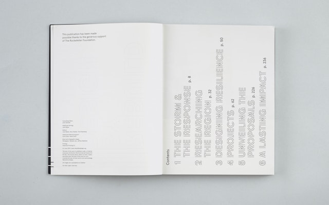
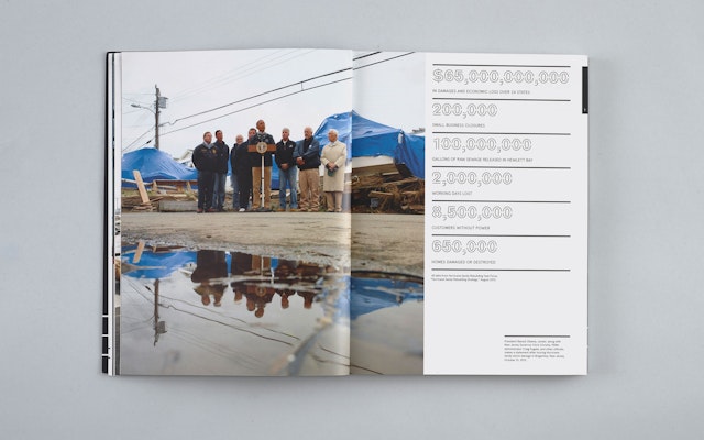
From the 148 international applicants who participated in Rebuild by Design, 10 interdisciplinary teams were selected to compete in the year-long process. Naturally, these 10 approaches were all visually quite different, and each was accompanied by a mass of data, diagrams, maps, renderings, images and other information. For the designers, the challenge was developing a cohesive framework for the book that would both systematize and set off the various solutions. The designers used custom typography and a striking black and white format to create a strong visual language that ties everything together with impact.
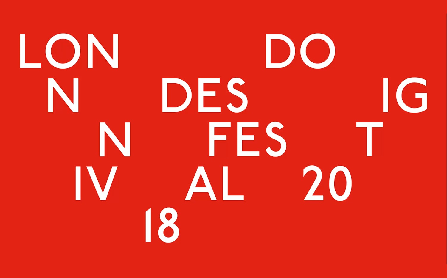
Called Rebuild Outline, the custom typeface is inspired by the process of reframing, reconstructing and rebuilding. The letterforms appear to be under construction, with the structure of outlines partially visible. The typeface is used for title typography, and on the book cover, in the table of contents and in section openers, the words have been set on end, like buildings going up. Secondary type and text are set in , which echoes the look of the program’s existing identity.
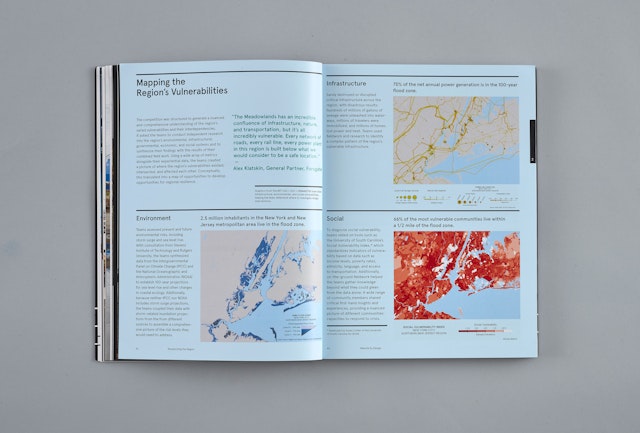
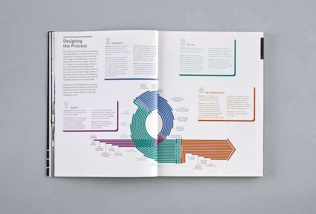
Rebuild by Design brought together a consortium of government agencies, non-profit institutions, philanthropic foundations and design associations, and the program was fairly complex. The designers created a series of infographics that helped explain the competition, the network of collaborating organizations and the Rebuild by Design process.
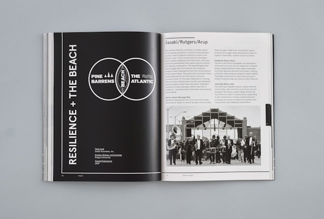
Title spreads in black and white introduce each of the proposals from the ten shortlisted architecture teams: BIG Team; HR&A Advisors with Cooper Robertson & Partners; Interboro Team; MIT CAU + ZUS + URBANISTEN; OMA Team; Penn Design/OLIN; Sasaki/Rutgers/Arup; SCAPE/LANDSCAPE ARCHITECTURE; WB unabridged with Yale Arcadis; and WXY/West 8. Six winning proposals and one finalist were selected in 2014, and HUD has announced allocations totaling $930 million to begin implementing the projects.
The book is available for download .
Sector
- Arts & Culture
- Civic & Public
Discipline
- Books
Office
- New York