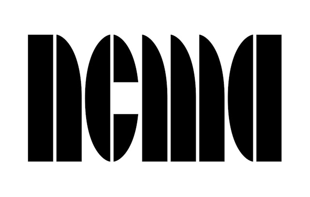


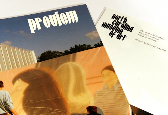
Working with the NCMA staff, Pentagram developed a custom alphabet based on the expansion building's most distinctive architectural feature: the oval-shaped skylights that will bring light into all the new gallery spaces.
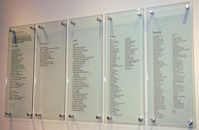

Often, museum graphics err on the side of anonymity, assuming that art needs a recessive frame to shine. Not so at the , which was dramatically transformed in 2010. An expansion building designed by 聽added 127,000 square feet of exhibition space to the museum's original 1983 building by . Adjacent to the these buildings is a 449-seat open-air amphitheater; the entire complex is set within a 164-acre park filled with sculpture and walking trails. Pentagram was asked to create a new signage and wayfinding program as well as a new graphic identity that would reflect the boldness of the museum's transformation.
Working with the NCMA staff, Pentagram developed a custom alphabet based on the expansion building's most distinctive architectural feature: the oval-shaped skylights that will bring light into all the new gallery spaces. In developing the typeface, the designers were inspired by another designer with North Carolina roots, , the legendary Bauhaus artist who taught in the 1930's and 40's at in Asheville; his geometric studies are well-represented in the NCMA collections.
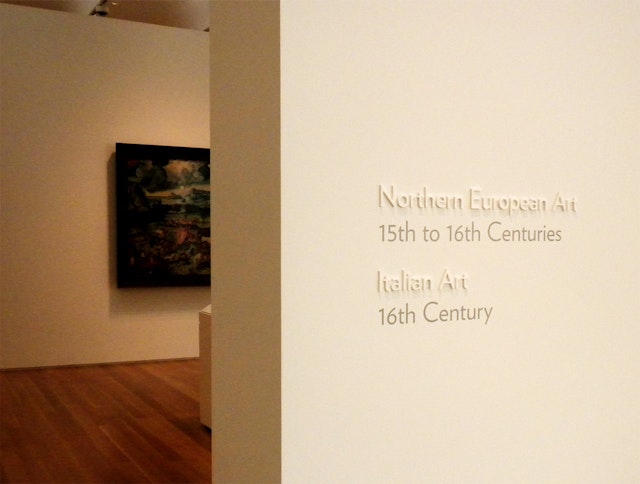
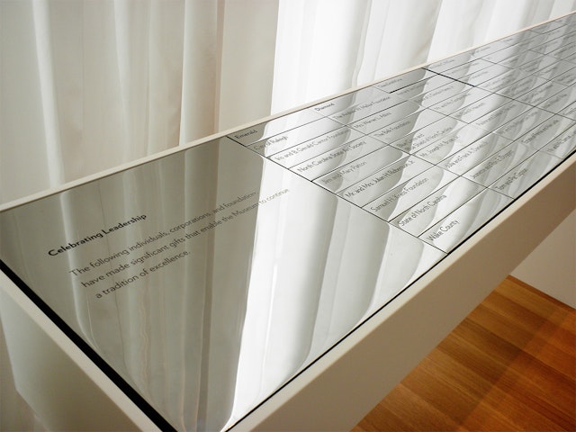
The custom alphabet then permits the NCMA spirit to infiltrate the range of activities the museum sponsors. The distinctive new look is arresting at first, especially compared with its previous, much more anonymous, identity.聽
Client
North Carolina Museum of ArtSector
- Arts & Culture
Discipline
- Brand Identity
- Signage & Environmental Graphics
Office
- New York