
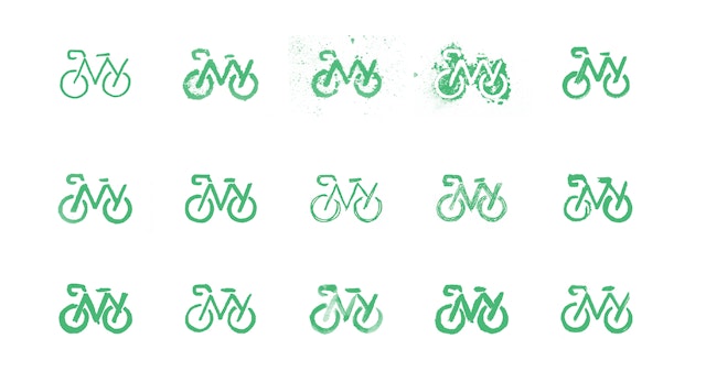


Inspired by the straightforward visual icons of street signage, the letter-based logo is composed of stencil-like shapes that literally illustrate the organization’s name: The letters ‘NY’ form the frame of a bike.


The color palette is inspired by riding in the streets: the program uses the same green as New York’s bike lanes, accompanied by the slate grey of pavement, the yellow of lane markers, and for accents, a safety orange and a sky blue.


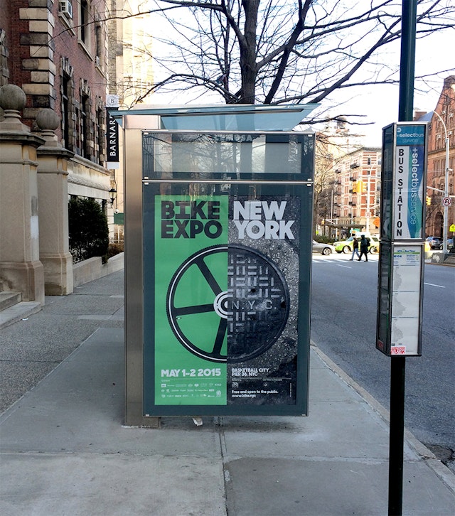
Pentagram has designed a bold new identity for , the city’s leading proponent of biking as a practical, sustainable, and healthy means of transportation and recreation. Along with the identity, the update includes a redesign of the Bike New York website, cycling guides and other collateral.
With a growing network of over 900 miles of bike lanes and the recent launch of the Citi Bike bike-share program, cycling in New York is more popular than ever. Over the past year and a half, the designers have been working with Bike New York on elements of its brand identity and messaging, with the goal of helping the non-profit organization better engage and connect with all of New York’s riders.
Bicyclists are passionate about riding, and Bike New York wants its programs and initiatives to resonate with the cycling community and accurately reflect bike culture. At the same time, one of Bike New York’s most important initiatives is education and so, as more New Yorkers take up cycling, the organization hopes to reach out to new riders and become their go-to source for biking knowledge. The group provides free bicycle classes for riders at all skill levels, as well as lessons in related topics like bike maintenance, commuting, and how to buy a bike. Last year the organization taught bike skills to over 16,000 New Yorkers.
Friendly and accessible, the new brand identity features a simple logo that is designed to help Bike New York raise its profile and become closely associated with biking in the city. Inspired by the straightforward visual icons of street signage, the letter-based logo is composed of stencil-like shapes that literally illustrate the organization’s name: The letters “NY” form the frame of a bike. The mark is instantly recognizable and also remarkably easy to draw, so anyone can make it their own; the designers created a series of hand-drawn versions, which have been animated on the Bike New York website.
Typography is set in , with the wordmark appearing in italics for a sense of motion. The designers worked with Bike New York to reconfigure copy so the words that make up its name—“bike” and “New York”—can be set off in the messaging of various applications like riders guides and the Bike New York website.
The color palette is inspired by riding in the streets: the program uses the same green as New York’s bike lanes, accompanied by the slate grey of pavement, the yellow of lane markers, and for accents, a safety orange and a sky blue. The team had fun designing graphics for official Bike New York gear and apparel, where the green bike lane makes a stylish stripe up the zipper on jackets.
There’s nothing quite like experiencing New York City on a bike, and the retooled Bike New York website captures this feeling with a eye-catching design that immerses users in New York bike culture—but in an appealing way that makes everyone feel like they can participate. Photography is used to create a personal, “you are there” connection with the city, showing the thrill of riding in the streets. The site also features portraits of actual cyclists taken by , a Brooklyn-based photographer who recently published the book New York Bike Style and is also Bike New York’s communications manager. The designers created a series of playful custom icons for the site, and the layout’s graphic elements use shapes and patterns—circles, lines, bars—found in bikes and traffic markings.


