


The shape functions both as a monogram—it updates an existing “AB” configuration—and a memorable symbol that graphically illustrates the bank’s emphasis on community and working together.


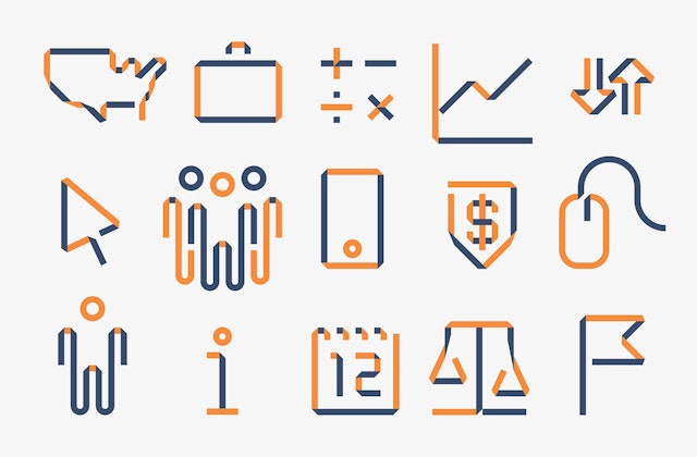
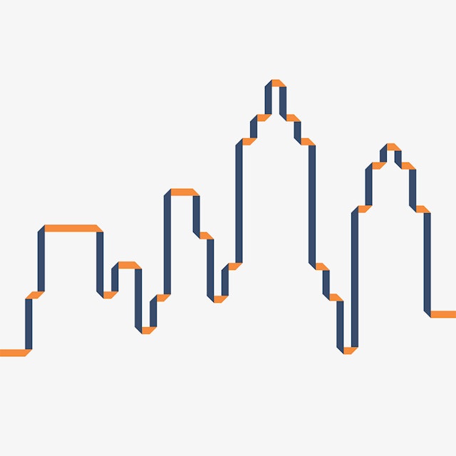


Building on the folding action found in the mark, the designers created a playful suite of icons to support the Amalgamated brand online, in collateral and on ATM screens.


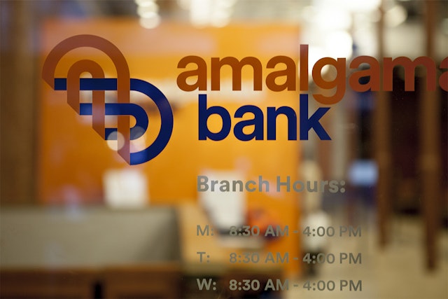
is the leading financial institution dedicated to providing affordable banking services to working people, unions, and progressive organizations and businesses. Established in 1923 as New York City’s first labor bank, Amalgamated is now the largest union-owned bank in the United States, with locations across the city, as well as in Washington DC, New Jersey, Nevada and California. Pentagram has designed a new brand identity for the bank that updates its look while also honoring its legacy.
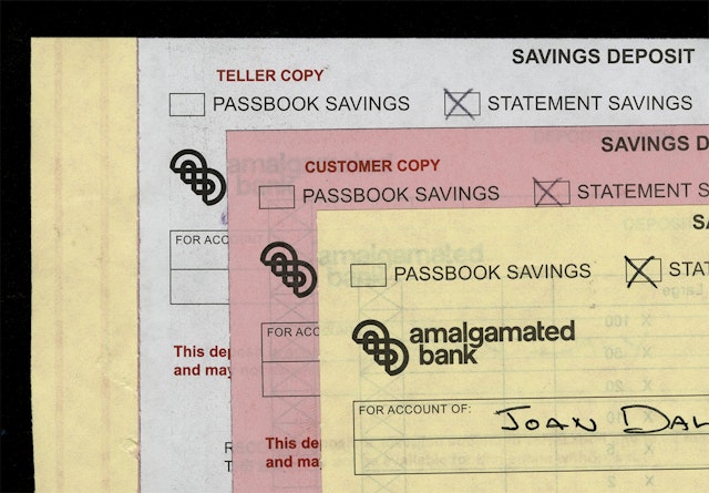
Amalgamated has its roots in the union , now part of , current majority owner of the bank. The bank’s heritage in the garment manufacturing union inspired the new mark, which weaves two forms together like fabric and resembles an abstract "A" and "B."
The mark is woven from two folded loops, suggesting strength and unity, good traits for a bank. (The definition of amalgamate is “combine or unite to form one organization or structure.”) The shape functions both as a monogram—it updates an existing “AB” configuration—and a memorable symbol that graphically illustrates the bank’s emphasis on community and working together.
During research in the Amalgamated archives, the designers came across an “AB” seal that appeared on a brochure from the 1960s. The monogram in the seal weaved together the “AB” into a tight, almost abstract form. The line work and sewn-together quality helped inspire the new mark. The new symbol appears in a contemporary color palette of blue and orange, a nod to the colors of . (Not to mention two of the city’s beloved .) The identity is set in the friendly sans serif font . serves as the secondary typeface.
Building on the folding action found in the mark, the designers created a playful suite of icons to support the Amalgamated brand online, in collateral and on ATM screens. The symbols bend the lines of the mark into new forms related to money, business and service.
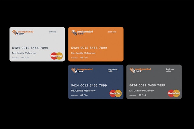
The designers developed comprehensive guidelines for the new identity, which appears on all of the bank’s digital and print applications, as well as environmental graphics. The launch of the identity has been accompanied by a revamped Amalgamated website and interior and exterior renovations at many of the bank’s branch locations. In the tradition of the bank's political awareness, a new advertising campaign designed by ties into the 2014 fall elections.
Office
- New York


