


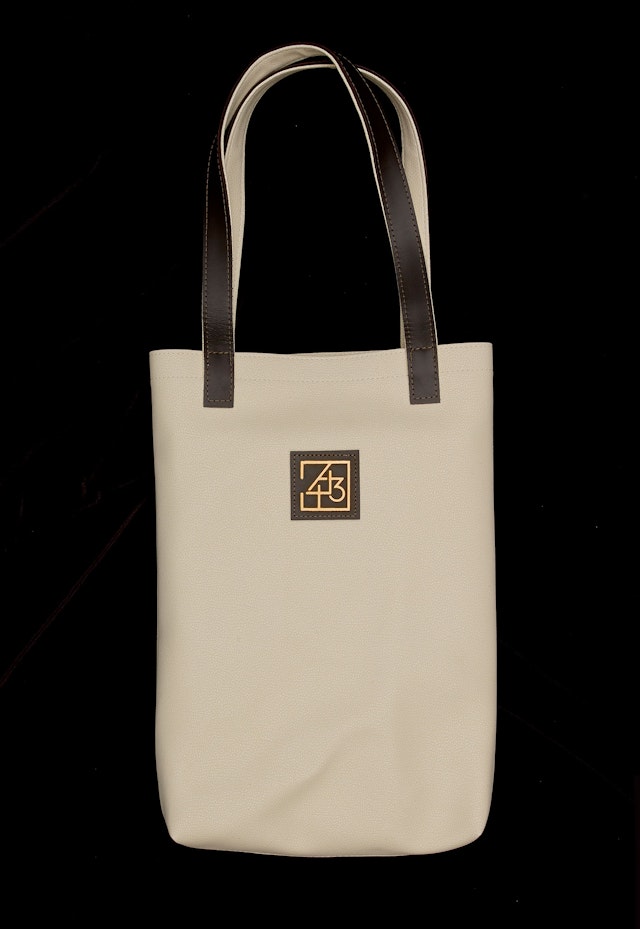
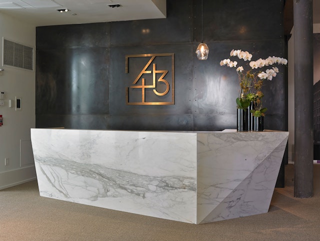
The identity highlights this amenity in the logo for the project, which suggests a view of a building plan with the square of the courtyard at the center.


Located in New York鈥檚 historic neighborhood, is a landmark 1882 factory building that is being transformed into luxury residences. Pentagram has designed the brand identity and marketing campaign for the development, which features a distinctive monogram inspired by the building鈥檚 unique floor plan and industrial past.
The designers worked closely with the building鈥檚 marketing and sales team, , and developers, , to create the campaign. Originally designed by the noted architect , the mammoth red brick structure occupies almost an entire city block and has variously housed glass, silver, toy, steel-wool and bookbinding companies over the years. Reimagined by project architects , the new 443 Greenwich Street comprises 53 modern condominiums with top-of-the-line design, construction and amenities that have made it one of the most desired properties in the area. In November the hit the market for $51 million, currently the most expensive listing in downtown New York.
One of 443 Greenwich鈥檚 prime amenities is its 4,000-square-foot , an unusual feature in New York City. The space will be repurposed as a tree-lined private garden for residents. The identity highlights this amenity in the logo for the project, which suggests a view of a building plan with the square of the courtyard at the center. Simultaneously strong and intricate, the logo also references the muscular architecture and angled streets of the area, as well as the industrial form of the building and its windows. The identity utilizes the typeface , a geometric sans serif that is a contemporary take on , a typeface developed around the same time as the building.
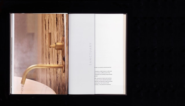
The rich materials used in the building鈥檚 renovation are reflected in the marketing collateral, which appear in a color palette of cream, deep brown and gold. Printed on textured paper, the main sales book comes packaged in a box with floor plans and other information. The book is divided into nine chapters that tell the story of the building through senses, rather than spaces: Sanctuary, for the bath; Light, for the windows; Craft, for the materials. The titles appear on half pages that, when turned, reveal pictures on their reverse, creating interesting juxtapositions. Large renderings are placed in gatefolds, so portions of the images are not lost in the gutter of spreads.
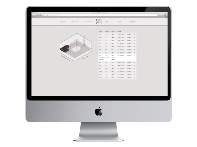
The campaign鈥檚 clean, elegant design extends to the website, which features a series of large-scale slideshows of renderings. Availability of units is displayed in a dimensional axon view of the building; when users hover over the number of an apartment, the diagram shows the position of the residence in the block of the building.


